Self-Promotional Materials
- Jun 13, 2024
- 8 min read
Updated: Jun 20, 2024
When developing the initial elements of a brand identity for Infrared Cornwall, there are several things I had to consider:
Purpose - to capture and share the ethereal beauty of Cornwall through infrared photography.
Values - creativity, innovation, authenticity, and personal connection.
Target audience - art collectors, local residents, and tourists.
Unique selling point - fine art infrared photography, an uncommon medium.
Colour palette - sampled from existing images, gold, soft red, and blue.
Typography - simple so as not to detract from the imagery. Possibly Calibri.
Consistency - the same colours, fonts, and formatting used across a range of materials.
Voice - friendly and knowledgeable.
Printed materials - business cards, postcards, and photo books.
Online materials - website and Instagram.


The colours I selected (Figure 1, above) have been consistently used throughout my materials, with one exception: some sections of my website feature darker shades of the same colours to enhance contrast and comply with accessibility guidelines. The photos used to develop this colour palette (shown in Figures 2 to 4, below) highlight the diverse effects achievable through infrared photography, resulting in a range of bright yet soft colours that harmonise well. The red signifies "infrared", the cream serves as a soft neutral, and the gold and blue are commonly occurring colours in my edited images.
To create a sense of authenticity and personal connection with my audience, I chose to hand-write and draw elements such as "Liz Jenkin", "Infrared Cornwall", and the camera doodle, which have been used throughout my materials.


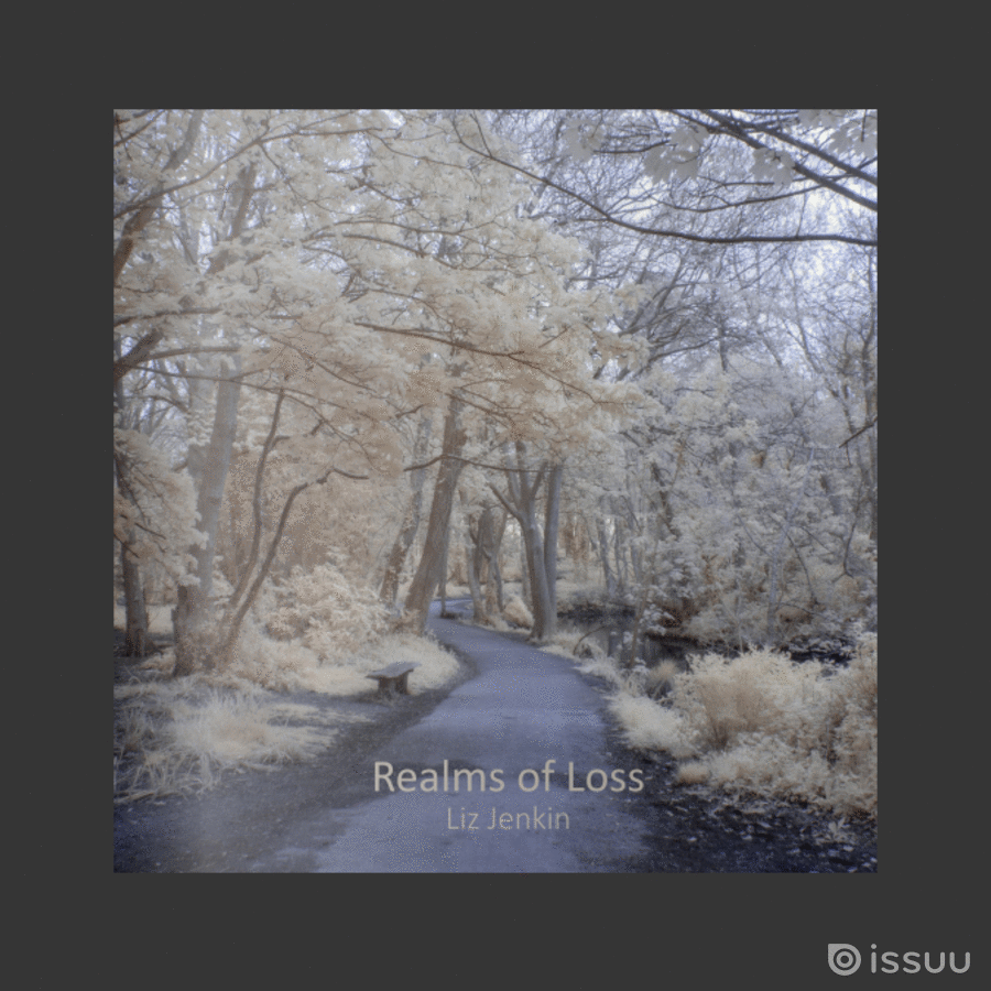
To showcase my Infrared Cornwall images, I decided to create a small photo book or zine that would be available at our exhibition for people to take away. A digital copy of this book is available on Issuu, accessible here or by clicking the GIF below (Figure 5).
For the book design, I chose a square layout to accommodate both portrait and landscape images without placing multiple images on one page. I opted for Mixam to print my books and considered their standard square sizes: 120mm, 148mm, and 210mm (Mixam, 2023). I chose the 210mm size to ensure details in my photos were visible. As shown in Figure 10 below, all photos maintained the same aspect ratio, allowing uniform placement within the 10mm outer margins and 17mm inner margin to account for the gutter.
The images were divided into sections based on different types of loss, each beginning with a poem and a full-bleed image covering approximately three-quarters of the spread (Figure 9, below). I selected photos for the full-bleed section introductions that were visually quiet in the gutter area. Each section's introduction photo alternated between being left- and right-aligned. The poem text boxes were the same width, aligned with the centre of the page number box on the x-axis, and centred on the y-axis, ensuring consistency across all introductory spreads and the main body. Exceptions were made for the first page, featuring a centred poem, and the final page, which included a small centred image and poem. The poems were printed in Calibri Light, size 12, with titles and authors in Calibri Light Italic, size 10. I also used Calibri for all of the text on the cover to maintain consistency.
For the front cover (Figure 6, below), I selected an image that worked well as a square crop: a cool-toned woodland pathway, inviting the audience to journey through the realms of loss. I kept the back cover and spine simple by sampling colours from the cover image. I used the soft blue of the pathway for the back and spine and the pale cream of the leaves for the text. This cream was also used to create a box on the back cover where I placed colour-matched QR codes linking to my Instagram and website.


Mixam offers a wide range of paper options, so I requested a paper sample pack to help me choose the right coating and weight for my book. I have always preferred heavier books with thicker paper, as they feel more substantial and prevent images from showing through to the other side. Additionally, I love the tactile appeal of soft-touch lamination and felt it would give my book a more sophisticated and professional appearance. After immediately ruling out glossy paper due to its squeakiness when touched, I considered natural paper, which has a slightly cream hue rather than a brilliant white. However, because my book contains a mixture of warm and cool images, I chose recycled silk pages for their neutral tone and standard silk paper for the cover.
Ultimately, my chosen options were:
Size: 210 mm x 210 mm
Pages: Full-colour printing, 44 pages, 200gsm Recycled Silk
Cover: Full-colour printing (outside), Soft-Touch Lamination (outside), 350gsm Silk
Binding: Perfect (PUR)
I also ordered some business cards through Mixam, measuring 55 mm x 85 mm with rounded corners. They were printed on the same 350gsm silk with soft-touch lamination as the book cover to give them a luxurious feel and maintain brand consistency. One side features a photo from the Loss of a Secure Future section (Figure 11, below). The other side (Figure 12) contains my contact information with the same QR codes from my book. The background colour is the same cream sampled from my book cover, and the handwritten elements including "Liz Jenkin" and "Infrared Cornwall", along with a doodle of a camera, use orange and dark teal sampled from the photo overleaf. I chose to create these aspects by hand to give the cards a personal touch, aiming to create a sense of approachability for potential customers.
By carefully selecting these materials and design elements, I ensured that both the book and the business cards reflect the high quality and uniqueness of my infrared photography. The soft-touch lamination not only adds a sophisticated finish but also aligns with the tactile and aesthetic experience I want to provide to my audience. Ultimately, my project is about embracing our experiences of loss and finding peace, so I wanted my book to feel pleasant to hold. This cohesive branding across my book and business cards helps convey a professional yet personal and approachable image to my audience.


I had ordered and paid for 15 books and 30 business cards, but surprisingly, I received 23 books and approximately 450 cards. While I know that companies sometimes overprint and send the extras, I did not expect to receive so many! Overall, I am delighted with the printed book. Some of the images, particularly those taken in Bodmin Jail, printed a bit darker than I anticipated, but I feel this minor difference does not detract from the images or the book as a whole.


I also used the handwritten elements and sampled colours from my business cards to create some postcards (Figures 17 to 20, above). Each postcard features a cream border on the front and back, with a desaturated blue area for a stamp on the back, also bordered in cream. The handwritten "Infrared Cornwall" with the camera doodle is centred at the top of each postcard. At the bottom, I have included small text with an image copyright notice, a brief image title, and the location where it was taken.
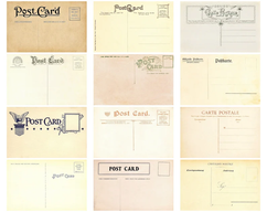
When looking at other postcards and templates, I noticed that their primary use now is for marketing and business promotion, rather than the traditional use of sending messages and mementoes to loved ones from holiday destinations. However, I preferred the cleaner design of the contemporary postcards above in Figures 13 (Envato Elements, 2021) and 14 (Envato Elements, 2023) over the elaborate vintage ones in Figures 15 (Hart, 2017) and 16 (iStock, 2024). Therefore, I decided to design my postcards with elements from both old and new styles. I aimed for simplicity on the back, while still leaving room for people to write messages, so I ensured my branding elements were small and understated. This approach echoes my project's aim to give people space for reflection.
At the exhibition, the postcards were successful. I printed 80 in total (5 copies of 16 images), and approximately 70% of them were taken in under a week. This suggests that, even if the traditional use of postcards has declined, they are still appreciated as small prints. The most well-received cards featured the glimmering rook, the angel in the graveyard, the balancing quoit, and the blue lake, as all copies of these were taken. Each of these images comes from a different section of the book, indicating that most sections were equally appreciated. The least interest was shown in the photos taken at Bodmin Jail and the line of headstones in the graveyard. While some were still taken, this suggests these may be the least popular photos. Although I received positive feedback about the images themselves, I understand why people might not want to send their loved ones a "wish you were here!" postcard that features a graveyard or prison.

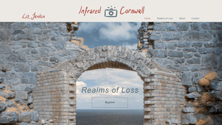


To add further interactive elements and additional ways to access my project, I created a website. This simple site consists of a homepage with a navigation bar containing two anchor links: one leading to an About section, and the other to a Contact section. Additionally, the navigation bar has a dropdown menu directing users to the Realms of Loss and its six subpages. In the middle of the banner image on the homepage, there is an Explore button which also leads to the Realms of Loss page.
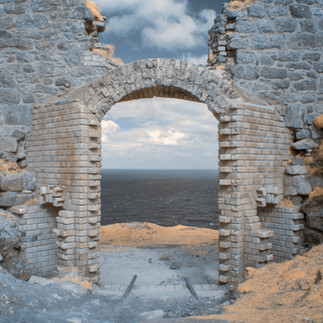
To maintain consistency across different mediums, I used the same design elements and colours from my business cards and book for the website. Inspired by Simon Marsden's architectural photography (The Marsden Archive, n.d.), I wanted to feature an image of an archway as the homepage banner, inviting visitors to embark on a journey through the realms of loss by clicking the Explore button centred in the archway. Originally, I had planned to use the photo shown in Figure 21 (above), but another local photographer objected, feeling it was too similar to their work. While my lecturers and I maintained that mine was an original work that was coincidentally taken in the same public place, I chose to replace the image as a gesture of goodwill. For a short while, I substituted the image with one of a different archway from the same location (Figure 22), before finally visiting Wheal Peevor to capture a new photograph specifically for the banner (Figure 23). I had intended to change the banner image after completing this unit of work, as I cannot display photos of National Trust sites on a commercial website. However, this conflict brought that decision forward.
The website is set up with ongoing work in mind. Currently, it showcases only this project, but I plan to develop it into a professional site in the future. The colours on the site mostly match those used in my other materials (Figure 24, above), but some have been darkened to ensure maximum accessibility by providing sufficient text/background contrast within the recommended range. All images are labelled and include alt text for screen readers to enhance accessibility, as seen in Figure 26 (above). The site is simple and easy to navigate, featuring a "back to top" button on every page. In addition, the bottom of each content page contains a range of useful hyperlinks, including Google Maps links to the locations where the pictures were taken, links to the poetry cited, and links to referenced research in the accompanying text.
I have included a contact form on the website, which securely stores data (Figure 25). The form includes a statement explaining that information will only be kept for communication purposes and not for newsletters or other marketing activities. Before launching the site as a professional platform, I will ensure it is GDPR-compliant and add an accessibility statement and privacy policy. The website is a premium Wix site, and while I have purchased a domain name (www.infraredcornwall.com) the site is still accessible through the free Wixsite URL (www.lizjenkin.wixsite.com/infraredcornwall) and the QR codes printed on my books and business cards. I also have the option to set up a shop for selling prints and other products, but I will wait until the policies are completed to ensure the security and privacy of my prospective clients.
References
Envato Elements (2021) Minimal Postcard, Envato Elements. Available at: https://elements.envato.com/minimal-postcard-C2LAL7 (Accessed: 12 June 2024).
Envato Elements (2023) Postcard Template, Envato Elements. Available at: https://elements.envato.com/postcard-template-9K9S7Z (Accessed: 12 June 2024).
Hart, W. (2017) 12 antique postcard backs instant download set of 12 printable postcard backs download, Postcard Collage Sheets, vintage postcard backs - etsy France, Etsy. Available at: https://www.etsy.com/fr/listing/784317302/12-antique-postcard-backs-instant (Accessed: 12 June 2024).
iStock (2024) Vintage postcard back pictures, images and stock photos, iStock. Available at: https://www.istockphoto.com/photos/vintage-postcard-back (Accessed: 12 June 2024).
The Marsden Archive (no date) The Marsden Archive. Available at: http://www.marsdenarchive.com/ (Accessed: 20 February 2024).
Mixam (2023) Photography books: Printing your photography book, Mixam. Available at: https://mixam.co.uk/photographybooks (Accessed: 27 April 2024).

Comments